Menu

ACCESSOS

Simplifying the emergency reporting process for users by 33% while
collecting 50% more crucial information for dispatchers

Reducing cognitive load and the number of steps needed for people with disabilities to report an emergency to 911.

making emergency help

accessible

Project overview

overview

overview

overview

PRODUCT

37 million Americans can't hear or speak out loud. AccesSOS app allows them to contact 911 without the need to speak and hear.

CHALLENGE

My main challenge is to make the emergency reporting process quick, while collecting enough information about accidents for dispatchers.

SOLUTION

More automation, and new functionality that will allow users to pre-save their personal information and automatically send it to dispatchers.

RESULT

Following the redesign, the number of steps was reduced from 12 to 8, decreasing completion time from 8 to 3 minutes.

TOOLS

TECHNOLOGIES

iOS, Android, PWA

RESPONSIBILITIES

UX Design, Content Design,
UX Writing, Accessibility

Design Strategy, UX Design, Content Design, UI Design, Accessibility, Design System

TEAM

Project Manager, UX Researchers,
UX/UI Designers, Developers, Marketing

DURATION

Oct 2023 — Jul 2024

DESIGN PROCESS

The PROCESS

1

Discover

Existing app analysis

Review of previous research

User interviews

Secondary research

Competitive analysis

Existing app analysis

Review of previous research

User interviews

Secondary research

2

Analyze

Usage analytics

Documentation analysis

Use cases


Metrics analysis

Documentation analysis

Use cases

3

Design

Ideation

Wireframing

Testing

Prototyping

Testing

4

Test

Usability testing

Launch

Usability testing

Launch

CHALLENGES

Balance between user and dispatcher needs

How do we collect enough information for 911 dispatchers while keeping it short for users?

Users have no time and might be in pain. Dispatchers need as much info as possible. AccesSOS needs to encode the message and doesn't accept free text.

How much freedom to give users?

Can they select multiple emergency types?
What will they write in textboxes?

Find study participants

People with disabilities who previously were in emergeny
situations are a very specific target group.

Organize emergency scenarios

With about 20 emergency scenarions identified,
how do we present them to users to choose from?

DISCOVERY

EXISTING PRODUCT

WHAT DOES NOT WORK?

WHAT DOES NOT WORK?

Unlike other apps and means to contact help that rely on speech or understanding English text, accesSOS is icon-based and silent.

TARGET AUDIENCE

WHAT DOES NOT WORK?

WHAT DOES NOT WORK?

Deaf and Hard of Hearing

Non-verbal

Low English Proficiency

Cognitive Disabilities

HOW IT WORKED BEFORE

WHAT DOES NOT WORK?

WHAT DOES NOT WORK?

1

The app locates you

and communicates your GPS coordinates

to dispatchers.

and communicates your GPS coordinates to dispatchers.

and communicates your GPS coordinates to dispatchers.

2

Choose required services

Choose services

depending on a situation, it can be Medical,
Police, Fire or Mental Health services

depending on a situation, it can be Medical, Police, Fire or Mental Health services

depending on a situation, it can be Medical, Police, Fire or Mental Health services

3

Answer questions

about your situation

4

Send the generated SMS

created according to dispatchers' needs

5

Wait for help

and try to stay calm.

WHAT DID NOT WORK WELL?

WHAT DOES NOT WORK?

WHAT DOES NOT WORK?

While the app offers features like automatic location detection and gathers vital details about the nature of the emergency, certain critical information such as door codes, vehicle descriptions, floor and apartment numbers are omitted for the sake of brevity. These details hold significant value for dispatchers.

Very few emergency icons

Accident icons were the same regardless of emergency type

Too many questions.

Vague location

Besides GPS coordinates, dispatchers need to know floor and apartment numbers, door codes, landmarks etc.

But it only communicates coordinates. Dispatchers need more: apartment number, door codes, etc.

Too many steps

Choose services

Users had to navigate through 12 screens to complete the process, which took 8 minutes on average

Users could choose many options. This slowed down decision making process.

Accessiblity

Send the text

Icons, language and interactions were not accessible

This step was completed in messaging app. Confusing for users.

In the initial designs, users were presented with 12 icons to describe their emergency: 4 for Medical, 3 for Police, 2 for Fire, and 3 for Mental services. This limited number of options lacked a clear order.


Moreover, the system lacked options, leading users to select "None of the above" which was uninformative. Enhancing icon selection efficiency emerged as a critical need from these findings.

GAPS IN RESEARCH

GAPS IN RESEARCH

A lot of user reseaarch has been done in the past, especially among people with disabilities.

However, there were significant gaps in team's understanding of user behaviors.

No Emergency Experience

People who experienced emergencies before were not included in research

No Experience
Calling 911

People with experience contacting 911 were not included.

No Testing in Emergencies

How can you replicate the anxiety of an emergency situation? No usage metrics available.

FILLING THE GAPS: KEY FINDINGS

FILLING THE GAPS: KEY FINDINGS

FILLING THE GAPS: KEY FINDINGS

To cover these gaps I conducted a lot of desk research about people's (disabled and not) experiences with 911 and surveyed 911 dispatchers.

Preparation for Different Situations

Users with disabilities, particularly cognitive disabilities,

prepare for possible emergencies and rehearse their plans.

Unclear Thinking

Impacted by fear and panic, people can't provide relevant

information. Many can't provide any.

Simple Descriptions

Few callers possess a medical diagnosis; most rely on

describing their symptoms.

Caregiver Dependency

They often depend on designated emergency

contacts for assistance during critical situations.

DOES A SIMILAR APP EXIST?

Not really.


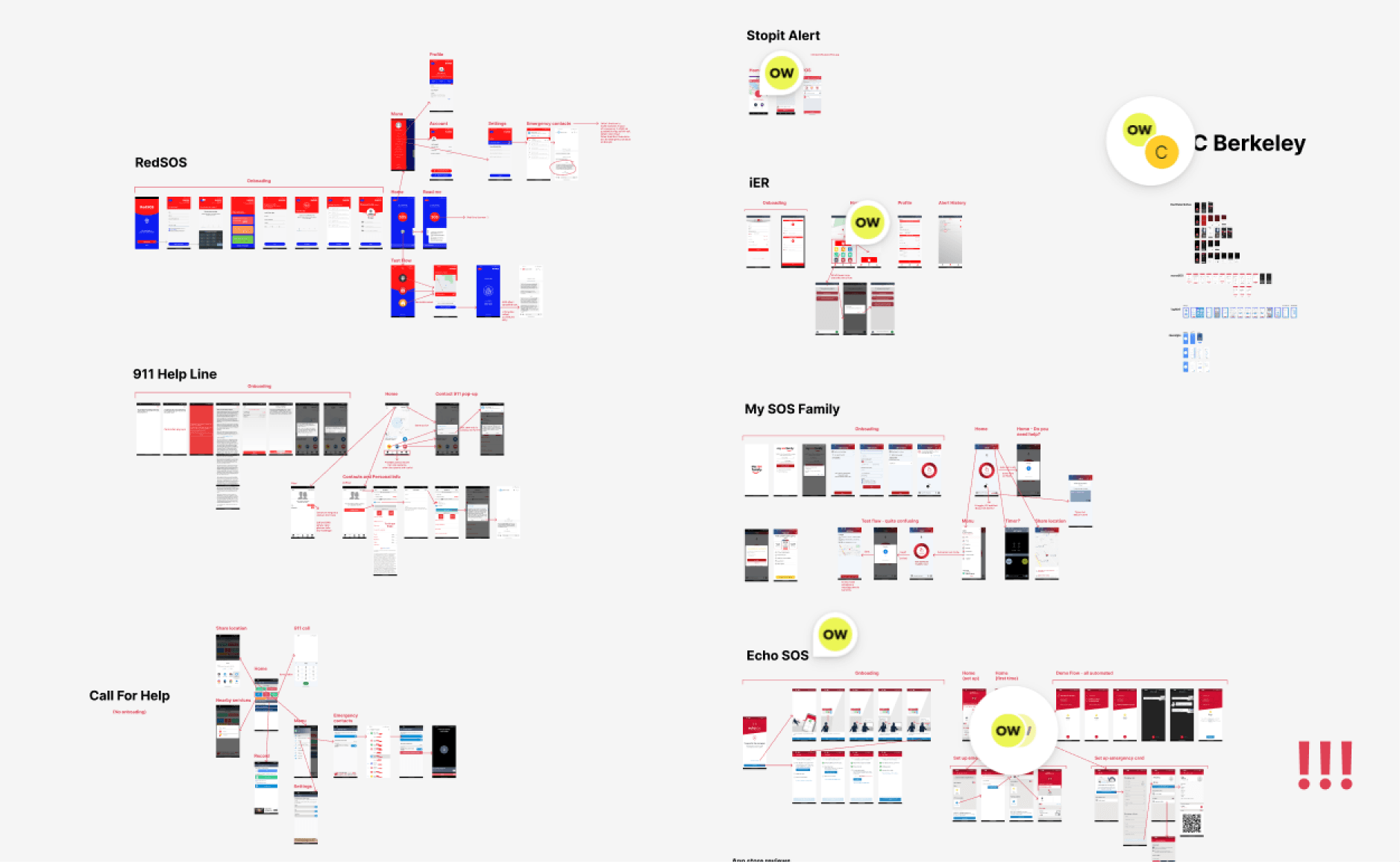
Among similar apps, I found a common reliance on voice or two-way texting interfaces. None of these solutions effectively targeted our entire audience.


The most significant insight from this competitive analysis was the potential of integrating a pre-filled personal profile feature. These profiles would contain medical conditions, physical appearance, disabilities, and other considerations, and would be automatically sent to dispatchers, saving users time.

KEY FINDING

KEY FINDING

SOS ID

SOS ID

Save personal info like name, disability status, health conditions etc.

Save personal info like name, disability

status, health conditions etc.

ANALYSIS

KEY ACTIONABLE INSIGHTS

Prepare & Rehearse

Let users test the app

Save personal info

Save frequent addresses

Influence of Panic

Need clear structure Need directions

One step at a time

Dependency

Add emergency contacts

Can notify them, not 911

MORE FINDINGS

MORE FINDINGS

Users with disabilities, particularly intellectual disabilities, prepare for possible emergencies and rehearse their actions.

Impacted by fear, panic, and confusion, people in emergencies can't provide relevant information.

Dispatchers need information, but users want to spend as little time as possible reporting an emergency.

Users experience heightened panic and decision-making time increases as the number of options provided to them increases.

Individuals with disabilities often depend on designated emergency contacts for assistance during critical situations.

In specific sensitive emergency scenarios, users may feel apprehensive about engaging with public services.

DESIGN RECOMMENDATIONS

RECOMMENDATIONS

RECOMMENDATIONS

DESIGN RECOMMENDATIONS

Incorporate features within the app that facilitate users' emergency preparedness.

Restrict free typing and implement structured input methods in the app to enhance effectiveness.

Enable users to expedite the reporting process by allowing them to pre-fill essential information in the app.

Limit the number of options, or restructure their presentation to expedite decision-making.

Integrate a feature that allows users to easily access and notify their emergency contacts in times of crisis.

Design the user interface to offer alternative means of accessing support.

DESIGN

DESIGN

  1. WHAT ICONS DO WE NEED?

How do we choose what icons users will see?

How do we provide more options without overwhelming the user?

In which order do we present icons?

1

Severity or frequency?

Display most severe or most common emergencies first?

What is more severe, chest pain or a seizure?

2

Symptom or diagnosis?

Do we display medical terms (stroke) or common symptoms

(pain, weakness)?

3

Choose multiple?

How do people decide what emergency services they need?

Who would they contact if there's a traffic accident with wounds?

UNSUCCESSFUL ATTEMPTS

Below are screenshots of our multiple attempts to make sense of different emergency scenarios.


Why none of them worked? Based on multiple A/B testings and usability studies, we identified key issues: freedom to choose multiple options slows down completion time, scrolling increased decision-making time and is difficult for people with cognitive disabilities, scrolling is not convenient when moving, severity does not guarantee frequency.

  • Why this didn't work:

    Users didn't realize they needed to scroll down to see icons from another selected category

    The necessity to make two choices increased completion time

    Difficulty in organizing icons when more than 2 emergency types selected

  • Why this didn't work:

    Dropdown functionality was unknown for some users

    Icons weren't grouped intuitively

  • Why this didn't work:

    Whether an emergency was "life-threatening" varied tremendously among users

  • Why this didn't work:

    Scrolling made it harder for users to stay focused;
    Scrolling was difficult on the move

  • Why this didn't work:

    Unclear grouping

  • Why this didn't work:

    1. Main idea: report your emergency as fast as possible
      give users the ultimate freedom to skip any step

    2. When connected to a dispatcher, text your situation


    This method wasn't understood by users.

    Dispatchers believed it would be hard to elicit details quickly.

  • Why this didn't work:

    Users didn't realize they needed to scroll down to see icons from another selected category

    The necessity to make two choices increased completion time

    Difficulty in organizing icons when more than 2 emergency types selected

  • Why this didn't work:

    Dropdown functionality was unknown for some users

    Icons weren't grouped intuitively

  • Why this didn't work:

    Whether an emergency was "life-threatening" varied tremendously among users

  • Why this didn't work:

    Scrolling made it harder for users to stay focused;
    Scrolling was difficult on the move

  • Why this didn't work:

    Unclear grouping

  • Why this didn't work:

    1. Main idea: report your emergency as fast as possible
      give users the ultimate freedom to skip any step

    2. When connected to a dispatcher, text your situation


    This method wasn't understood by users.

    Dispatchers believed it would be hard to elicit details quickly.

BETTER APPROACH: NO SCROLLING, GROUP BY FEATURE

This redesign is based on official statistics, dispatcher surveys and usability studies findings.

This way of presenting led to a significant cut in average completion time - decreased to 3 minutes.

My process:

1

Identify the most frequent scenarios in each emergency type (medical, police,

fire and mental) according to 911 statistics.

2

Group the scenarios by key symptom/feature.

3

Present icons from broader to a more narrow category.

4

Limit to 1 choice.

To better organize emergency icons on the page, I analyzed

911 statistics available online.

RESULT: MORE DETAILED OPTIONS

As a result, the need to scroll was eliminated and users were given more choices to describe their emergency.

  1. REDUCING THE NUMBER OF STEPS

In order to increase the chances for our users to finish the flow within the short amount of time they have, we had to find ways to prioritize what's most important.

In order to increase the chances for our users to finish the flow within

the short amount of time they have, we had to find ways to prioritize what's most important.

SOS ID

By giving users a way to save their personal information on their emergency card, we could remove name, accomodations from the flow.

More automation

accesSOS app will automatically send the generated text, users don't need to open their messaging app anymore


Frequent addresses

Allow users to save frequent addresses (home, school, work)

Less priority

Focus on the most important details. Other info, like who needs help can be given to dispatchers later through texting.

RESULT

RESULT

User flow went from 12 screens to 8.

SOS ID

Pre-filled personal information saves time when reporting an emergency

But it only communicates coordinates. Dispatchers need more: apartment number, door codes, etc.

Frequent Addresses

Choose services

If the detected location is near one of the saved addresses, users will select it (with all apartment numbers and door codes).

Users could choose many options. This slowed down decision making process.

Full User Flow (Mid-Fidelity)

Choose services

If the detected location is near one of the saved addresses, users will select it (with all apartment numbers and door codes).

Users could choose many options. This slowed down decision making process.

  1. ACCESSIBLE INTERFACE

When building a design system, we kept in mind accessiblity standards, environmental factors such as bright daylight or shaking hands, aimed for simplicity and minimal content on page to avoid distraction.

High contrast

High
contrast

High
contrast

Bigger elements

Bigger
elements

Bigger
elements

Minimum content

Minimum
content

Minimum
content

LANGUAGE CONSIDERATIONS

LANGUAGE CONSIDERATIONS

To improve language clarity and accessibility, we used the Common European Framework of Reference for Languages (CEFR). CEFR is an international standard for describing language ability and it organises language proficiency in six levels - A1 to C2. We audited the wording across the app and converted higher proficiency levels (B1 to C2) to basic level (A1, A2)


We also revamped the presentation of certain questions in our app to enhance their actionability and highlight their significance.

RESULTS

RESULTS

Since I joined the accesSOS team, we have saved 89 lives with our emergency reporting app.


NEXT STEPS

Finalize design
system

Finalize
design
system

Finalize
design
system

Test final
prototype

App update

Success analysis

Success
analysis

Success
analysis

VIEW MY OTHER CASE STUDIES

VIEW MY OTHER CASE STUDIES

M3 CRM PORTAL

Driving Interaction: A Revamped CRM for Active Client Engagement

PAWS CLINIC APP

increasing the chances of good matches and happy adoptions

I'm available for work. Let's talk!

I'm available for work.

Let's talk!

olyalwarren@gmail.com

I'm available for work. Let's talk!

olyalwarren@gmail.com